Lesson 2: Best Practices
Introduction
As we move on to larger or more complex website projects the need can arise to become more meticulous with how we name and organize our CSS classes. We can also become more intentional with the way to plan and layout out the more intricate details of our projects. Microformatting allows us to pay attention to the details of the data we're marking and styling and microlayouts give us a construct for how to analyze and build out smaller components of our designs. Behind it all we can employ a convention such as BEM to keep smart and sane amidst the growing complexity.
CSS Variables
So have you ever felt like you repeated a lot of values in CSS? Particularly abstract values like hex color codes or long values like font stacks?
We now have the ability to use variables in CSS. The idea here is that we provide a semantic alias for a value and then we can call that alias in our CSS and the value it represents will be inserted by the browser. This allows us to avoid the abstract or long values and instead use the semantic aliases.
This involves two steps.
Usually near the top of our stylesheet we add a
:rootselector and then in it declare variables with the--prefix like this::root { --teal: #2AB798; --plex: 'IBM Plex Sans', sans-serif; }We call the variables as a value in our CSS using the variable name inside
var()like this:h1 { color: var(--teal); font-family: var(--plex); font-size: 2.8rem; line-height: 3.2rem; }
Pretty neat, eh?
One thing we'll often do though is to not just use "teal" and "plex" as we often have a variety of values that can be categorized into groups such as "colors," "fonts," etc. So instead, we can use a prefix to help keep these organized. Consider:
:root {
  --color-teal: #2AB798;
  --color-fandango: #F33FA4;
  --color-slate: #4B494A;

  --font-body: 'Roboto', sans-serif;
  --font-heading: 'Playfair Display', serif;

  --size-body: 1.4rem;
  --size-h1: 6rem;
  --size-h2: 3.7rem;
  --size-h3: 2.3rem;
}
Try to use these for any values that repeat and do also make semantic sense to group with a label as these do.
Note: This is not fully supported in older browsers, but we're beginning to use it in many sites, and you're welcome to do so for projects in this course.
Microformatting
Up to this point you've probably been using a mixture of tag selectors, class selectors, and perhaps even id selectors when working with markup and CSS. Hopefully you've built good habits with using semantic classes such as .danger-status instead of .red-text and leveraged the power of nested selectors to avoid unnecessary redundant classes. Consider the merits of this:
<ul class="tasks">
  <li>Clean my room</li>
  <li>Take out the trash</li>
  <li>Wash the car</li>
</ul>
.tasks { ... }
.tasks li { ... }Over this:
<ul class="tasks">
  <li class="task">Clean my room</li>
  <li class="task">Take out the trash</li>
  <li class="task">Wash the car</li>
</ul>
.tasks { ... }
.task { ... }Its subtle, but the idea is that if we can avoid repeating .task on every li that is a benefit. We can accomplish the same effect with the nested selector .tasks li.
However, there are some times when it becomes helpful to make use of detailed classes, even those that repeat.
Consider this comp:
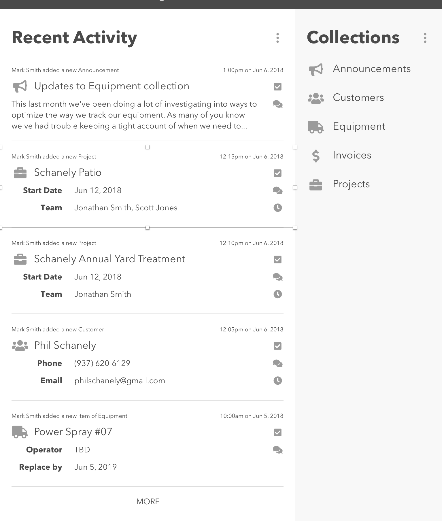
On the left we have a feed of activities that have happened in this application and on the right we have a navigation list to specific collections of data.
Let's work from the outside in to consider how we might label the elements in play here with classes.
First of all, the two sides can be labeled easily enough based on the headings we see:
<div class="acitivity-feed">
  <h2>Recent Activity</h2>
  <ul>
    ...
  </ul>
</div>
<div class="collections">
  <h2>Collections</h2>
  <ul>
    ...
  </ul>
</div>
Next, we can see each side includes a list, assumably that will each contain items. The Collection list is simplest: each item has an icon and a name:
...
<li>
  <img class="icon" src="..." />
  <span class="name">Announcements</span>
</li>
...
The other side is a little more complex, so let's consider what is common between all the items:
- they all have a description of the activity such as "So and so added a new project"
- they all have a date the activity took place
- they all have a set of icon-based controls that link to additional aspects such as tasks, comments and time logs
- they all have details about the thing that was affected by the action... but this is where differences arise
So consider this structure:
<li>
  <p class="description">Mark Smith added a new Announcement</p>
  <p class="date">1:00pm on Jun 6, 2018</p>
  <div class="details">
    ...
  </div>
  <ul class="controls">
    ...
  </ul>
</li>
Diving in further, all of the detail blocks have an icon, a name, and then additional data depending on the collection: announcements show the first bit of the full text of the announcement; projects show a start date and team members; customers show a phone number and email address, etc. So we could unpack things further like this:
<li>
  <p class="description">Mark Smith added a new Announcement</p>
  <p class="date">1:00pm on Jun 6, 2018</p>
  <div class="details announcement">
    <img class="icon" src="..." />
    <h3 class="name">Updates to Equipment collection</h3>
    <div class="full-text">
      ...
    </div>
  </div>
  ...
</li>
<li>
  <p class="description">Mark Smith added a new Project</p>
  <p class="date">12:15pm on Jun 6, 2018</p>
  <div class="details project">
    <img class="icon" src="..." />
    <h3 class="name">Schanely Patio</h3>
    <dl class="data">
      <dt>Start date</dt>
      <dd>Jun 12, 2018</dd>
      <dt>Team</dt>
      <dd>Jonathan Smith, Scott Jones</dd>
    </dl>
  </div>
  ...
</li>
...
Last of all, the icon controls could have a basic structure like this:
<ul class="controls">
  <li>
    <a href="#">
      <img class="icon" src="..." title="View tasks" />
    </a>
  </li>
  <li>
    <a href="#">
      <img class="icon" src="..." title="View comments" />
    </a>
  </li>
  <li>
    <a href="#">
      <img class="icon" src="..." title="View time logs" />
    </a>
  </li>
</ul>
What we're doing here is called microformatting. This enhances the semantic value and understandability of our code and also provides lots of helpful hooks for styling with CSS.
Hopefully this already makes a lot of sense to you since its not really differnet from what we've been doing to date. But now you have a label for it and can also begin to see how helpful it becomes to be consistent and intentional.
In general with microformats:
- Move away from referring to generic tags in our styles unless we're truly setting up default styles.
- Instead favor classes for labeling elements and selecting them with CSS.
- Strive for a balance between marking detailed data chunks and becoming burdensome with too much markup and classes.
<div class="acitivity-feed">
  <h2>Recent Activity</h2>
  <ul class="activity-list">
    <li class="activity">
      <p class="description">
        Mark Smith added a new Announcement
      </p>
      <p class="date">
        1:00pm on Jun 6, 2018
      </p>
      <div class="details entry">
        <img class="icon" src="..." />
        <h3 class="name">
          Updates to Equipment collection
        </h3>
        <div class="full-text">
          ...
        </div>
      </div>
      <ul class="controls">
        <li>
          <a href="#">
            <img class="icon" src="..." title="View tasks" />
          </a>
        </li>
        <li>
          <a href="#">
            <img class="icon" src="..." title="View comments" />
          </a>
        </li>
        <li>
          <a href="#">
            <img class="icon" src="..." title="View time logs" />
          </a>
        </li>
      </ul>
    </li>
    <li>
      <p class="description">
        Mark Smith added a new Project
      </p>
      <p class="date">
        12:15pm on Jun 6, 2018
      </p>
      <div class="details">
        <img class="icon" src="..." />
        <h3 class="name">
          Schanely Patio
        </h3>
        <dl class="data">
          <dt>Start date</dt>
          <dd>Jun 12, 2018</dd>
          <dt>Team</dt>
          <dd>Jonathan Smith, Scott Jones</dd>
        </dl>
      </div>
      <ul class="controls">
        ...
      </ul>
    </li>
  </ul>
</div>
<div class="collections">
  <h2>Collections</h2>
  <ul class="collection-list">
    <li>
      <img class="icon" src="..." />
      <span class="name">
        Announcements
      </span>
    </li>
    ...
  </ul>
</div>
BEM: A CSS Naming Convention
With the idea of microformatting in mind you can perhaps imagine that our ability to name things well becomes more important than ever. Its also very likely that our list of named things is going to get very large and we'll want to be appropriately specific with our naming. Consider for example that our collection items have a name and our activity items also have a name. How can we intentionally distinguish these two different "names?" Likewise, we have .icon applied in three different contexts: collection items have icons, activity feed items have icons and activity feed control items have icons. We're going to need to be more specific if we ant to stay sane.
The Block Element Modifier (BEM) convention poses a solution. Think for a moment about how you might describe the details in each side or our page:
- What are the prominent blocks that could be understood on their own if pulled from this layout? I'd say we have prominent blocks such as
- the Collection items (composed of an icon and a name)
- the Activity feed items (composed of details such as the action and time the action was completed)
- items inside of the Activity feed could be isolate further such as the details about the two new projects or the content of the announcement. As it turns out, these "actions" occur when a user adds or changes an entry in a collection in the system. So the Announcement that was added is a new entry to the Announcements Collection.
- the set of controls for tasks, comments, and time logs inside of each action could be seen as standalone components.
- What detailed elements make up each of these "blocks"? I'd say details such as the following could be seen as "elements" dependent on the block of which they're a part:
- Collection items have an icon and a name.
- Activity feed items have a date and description as well as details about the item that was changed or added.
- Can you see that there are blocks and elements that repeat but are slightly modified for some purpose? For example, the activity items repeat, and contain similar structure but slightly different data. Likewise, the control bars repeat, but in some items an item is highlighted to show a new comment or an overdue task. These changes can be seen as modifiers of a block or element.
This simple structure---Blocks, Elements, Modifiers (BEM)---provides a surprisingly robust convention for naming items on our pages as well as articulating their relationship to other items and ability to have changes applied that affect their style but not their structure.
BEM is a convention used to provide names for these components and states via CSS classes. Here are the basic rules:
things in the system use all lower-case letters with words separated by
-(otherwise known as kabob casing):button,task-list,status-danger.blocks are named simply using kabob casing. So...
- a navigation list block might be named
nav-list - an activity item could be named
activityor perhapsactivity-item.
- a navigation list block might be named
elements are prepended by their containing block, then
__(two underscores) and then the actual element name. So...- if the
collectionblock had aniconelement and anameelement, they'd be namedcollection__iconandcollection__name - if an
activityblock had adescription,date, andaffected-entry, they'd be namedactivity__descritpion,activity__date, andactivity__affected-entry.
- if the
elements and blocks are marked with a modifier by using the block or element's name followed by
--(double hyphen), and the modifier name. So...- if an
activityblock could be "normal" or "new" we could have a modifier namedactivity--new(since the normal might be the default state) - if a
control-bar__buttoncould be "new" or "overdue" in addition to "normal" we could have modifiers such ascontrol-bar__button--newandcontrol-bar__button--overdue.
- if an
when we implement modifiers we must include both the original class and the modifier class. Here's an example for a button that has an alert modifier:
<a class="button button--alert" href="#">Learn more »</a>items can have multiple labels on them... it is possible for an item to be both a block and an element of another block. It is possible for an item to have several modifiers.
Let's look at this all another way:
button-- a block called "button"button--alert-- a block with an "alert" modifier attached to it. Perhaps this button is colored different from normal buttons.button__icon-- an icon element within a button block. Perhaps there's also abutton__textelement nearby.button__icon--large-- an icon element that has a modifier of "large" that is within a button block.
So here is how I'd apply BEM to the markup we sketched in the last section:
<div class="acitivity-feed">
  <h2>Recent Activity</h2>
  <ul class="activity-list">
    <li class="activity">
      <p class="activity__description">
        Mark Smith added a new Announcement
      </p>
      <p class="activity__date">
        1:00pm on Jun 6, 2018
      </p>
      <div class="activity__details entry entry--announcement">
        <img class="entry__icon" src="..." />
        <h3 class="entry__name">
          Updates to Equipment collection
        </h3>
        <div class="entry__full-text">
          ...
        </div>
      </div>
      <ul class="controls">
        <li class="control">
          <a class="control__hyperlink" href="#">
            <img class="control__icon icon" src="..." title="View tasks" />
          </a>
        </li>
        <li class="control">
          <a class="control__hyperlink" href="#">
            <img class="control__icon icon" src="..." title="View comments" />
          </a>
        </li>
        <li class="control">
          <a class="control__hyperlink" href="#">
            <img class="control__icon icon" src="..." title="View time logs" />
          </a>
        </li>
      </ul>
    </li>
    <li class="activity">
      <p class="activity__description">
        Mark Smith added a new Project
      </p>
      <p class="activity__date">
        12:15pm on Jun 6, 2018
      </p>
      <div class="activity__details entry entry--project">
        <img class="entry__icon" src="..." />
        <h3 class="entry__name">
          Schanely Patio
        </h3>
        <dl class="entry__data">
          <dt>Start date</dt>
          <dd>Jun 12, 2018</dd>
          <dt>Team</dt>
          <dd>Jonathan Smith, Scott Jones</dd>
        </dl>
      </div>
      <ul class="controls">
        ...
      </ul>
    </li>
  </ul>
</div>
<div class="collections">
  <h2>Collections</h2>
  <ul class="collection-list">
    <li class="collection">
      <img class="collection__icon" src="..." />
      <span class="collection__name">
        Announcements
      </span>
    </li>
    ...
  </ul>
</div>
If I'm anticipating some common concerns I'll close with two final points:
- This probably seems rather subjective... how do we decide what is a block and what is an element within a block? Short answer... its up to you! Just try to be consistent. The rule I try to follow is if the thing you're consider could stand on its own and make sense it could be a block. Vice versa, if it makes the most sense when its grouped with other things perhaps its an element that is part of a containing block. And its also quite possible for a block to contain elements and for any of those elements to also be considered blocks that could stand alone. Again, the convention here is not meant to open up prescribe a one-size-fits-all definition of what is a block or an element. That is something you and your team can flesh out from project to project. Focus for now on practicing the convention.
- This probably seems to increase the size of your classes... and that is most often the case. But the benefits are also clear: we can be appropriately specific and we can be very consistent.
Organizing and Formatting
Now a few words about how we organize and format our markup and styles.
Formatting Rules
First, let's discuss formatting in general. In both HTML and CSS we can keep our code neat and easy to read if we ensure that...
- "child" elements or properties are each on their own lines and indented one tab to the right from the edge of the parent. Optionally, if an element has just text content we can also push this to its own line and indent it. Some even prefer to keep the text from extending beyond 60--80 characters and thus force text to wrap at that line.
- the closing syntaxes for a "parent" should also be on their own line and aligned with the left edge of the corresponding opening syntax.
More specifically, HTML markup should ensure that...
- attributes inside the opening tag are separated by precisely one space.
- favor putting a
classattribute directly after the opening tag. - self-closing elements should end with
/>rather than the looser>
So well-formatted markup should look like this:
<div class="thing">
    <h2 class="thing__title">
        The Amazing Thing's Title
    </h2>
    <ul class="thing__image-list image-list">
        <li class="image-item">
            <img class="image-item__image" src="#" />
            <p class="image-item__caption">
                Image 1 caption...
            </p>
        </li>
        <li class="image-item">
            <img class="image-item__image" src="#" />
            <p class="image-item__caption">
                Image 2 caption...
            </p>
        </li>
        ...
    </ul>
</div>
CSS sheets should ensure that...
- selectors are all aligned at the left edge of the editor
- opening brace is precisely one space after the end of the selector and on the same line
- properties are each on their own line and always end with
; - property names are immediately followed but
:(no space between the two) but a single space is entered after the:and before the property value. - closing brace is on its own line and aligned to the left edge of the editor.
Well-formatted CSS should look like this:
.thing {
    border: 1px solid black;
    border-radius: 4px;
    ...
}
.image-list {
    display: flex;
}
Organizational Rules
In terms of organizing our markup, it should already be apparent that each HTML file should contain only the conent of that particular page of our site. Inside a given file, we should simply ensure that our code is entered in the most logical source order for the content in question and use consistent conventions for class names such as BEM.
CSS styles can be organized many different ways. I have found that alphabetizing them makes them easiest to explore in the future.
On top of this, it can also be helpful to separate styles for a large site into different files. Consider this convention:
- In the root folder of the site create
styles.cssas the "root" stylesheet. In it, use@import url(...)to import all other stylesheets. As we break up our styles into separate files in the descriptions below, this single sheet will still pull them all together and can be used as the main stylesheet in each page of our site. - Add a
cssfolder and in it place the following:base.css-- this will include simple tag selectors to establish basic styles for elements such ashtml,body,ul,ol, etc.type.css-- this will include a mixture of simple tag selectors for typographic content elements such ash1--h6,p,li,blockquote, along with any BEM blocks that are distinctly typographical, if applicable.- Other styles would apply to blocks and elements from our BEM microformatting. In a smaller site we could put all of these in a single
blocks.cssfile. But in larger sites, it can be helpful to create distinct files for sets of related blocks, or even a distinct file for every block.
Overall, our aim is to break up what can become a large, unwieldy single stylesheet into much smaller, more focused files. This will make it much easier to maintain our style sheets over time.
Microlayouts
As handy as Flexbox is for creating large layout columns and tile patterns I often have much smaller and intricate needs for arranging elements. I have begun to call this situation microlayouts as they involve the same techniques as overall or larger layouts (they employ the same theory of tiles and containers) but the scope is much smaller---hence the "micro." For example, consider this example layout, but rather than considering the overall layout consider how you might build an individual task.
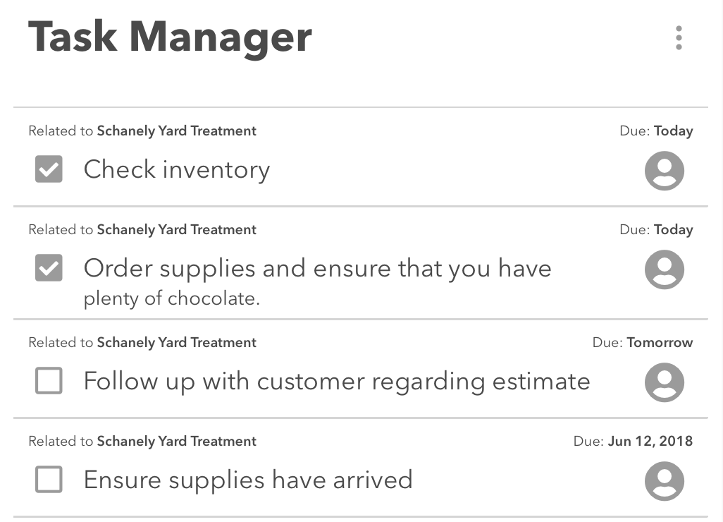
Employing BEM microformatting we might have the following markup structure:
<h2>Task Manager</h2>
<ul class="task-list">
  <li class="task">
    <p class="task__title">
      <span class="task__checkbox"></span>
      <em class="task__title-text">
        Follow up with customer regarding estimate
      </em>
    </p>
    <p class="task__due-date data">
      <span class="data__label">Due</span>
      <b class="data__value">Today</b>
    </p>
    <p class="task__assignee data">
      <span class="data__label">Assigned to</span>
      <img src="#" class="data__value user-image" alt="Your user avatar" />
    </p>
    <p class="task__relationship data">
      <span class="data__label">Related to</span>
      <b class="data__value">Schanely Yard Treatment</b>
    </p>
  </li>
  ...
</ul>
So we have the following blocks and elements within them:
datalabelvalue
task-listtasktitlecheckboxtitle-textrelationshipdue-dateassignee
user-image
Note that the relationship, due date, and assignee all also implement the data block. This helps to simplify the nested structure.
Now consider this highlight for the layout implemented for a single task:
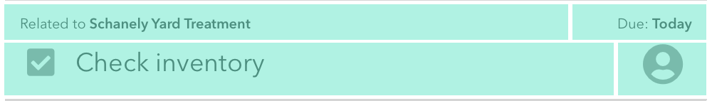
You can see here that the four mail elements, relationship, due-date, title, and assignee, can be treated as tiles and arranged using flexbox with task as the container.
You might have noticed even earlier that we coded the task in a different order than you might have expected given the way the information is presented. That's because we put an emphasis in our markup on coding using a logical source order. If we were describing this task, would we really say "Related to Schanely Yard Treatment" first? Likely we'd say what the task is first, and then support it with additional information such as when its due, to whom it is assigned, and to what it relates. This is the ideal way to do markup, but not always possible due to limitations of CSS. However, since all these items are peer "tiles" of the same "container" using flexbox we can use the order property to rearrange them visually as we build the layout. The four main elements are and we will arrange them in that order.
Here's the solution css that recreates the layout we want:
.task {
  display: flex;
  flex-flow: row wrap;
  justify-content: space-between;
}
.task__assignee {
  order: 4;
  width: 60px;
}
.task__due-date {
  order: 2;
  width: 100px;
}
.task__relationship {
  order: 1;
  width: 390px;
}
.task__title {
  order: 3;
  width: 430px;
}
The beauty of both CSS and this approach to microformatting is that the very same structure can be used to build the same list but laid out slightly differently such as in a more compact form:
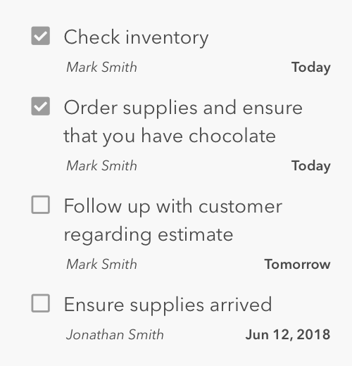
Here we've just hidden the .data__labels and the .task__relationship element. We've also swapped out the user's image for their name in the .task__assignee element. So... how would you adjust the layout settings to bring this layout about?